.png)

CASE STUDY
Movie Ticketing App

Project Overview
The Product
This Movie Ticketing App will make movie ticket purchasing quick and easy. Less clicks, more fun!
Project Duration
April 2023- August 2023
The Problem
Users were frustrated with the amount of time it takes to buy a movie ticket.
My Role
UX Research
UX Design
Prototyping
The Goal
I want to make purchasing from our app more streamlined to help our users to purchase quickly and avoid lines at the theater.
My Responsibilities
As the sole UX designer on this project, I was responsible for all aspects of the design process.
Pain Points
Sorting through too much information
1
Being able to filter information will make it easier for users to make a decision.
Complicated checkout
2
Eliminating the number of clicks to make a purchase will help streamline the purchase process.
Making decisions without outside input
3
Having reviews or ratings easily available will help users feel they are making an informed decision.
Summary
A primary user group identified through research interviews and empathy maps were working adults that want a streamlined movie ticket purchasing experience.
Research from this primary user group confirmed initial assumptions that users want a quick way to purchase movie tickets. This user group revealed that movie goers want outside opinions when making buying decisions.
User Research
![Google UX Design Certificate - Personas [Portfolio Project 1] (2).jpg](https://static.wixstatic.com/media/33b912_9378303860a24ba887910dce85bc915b~mv2.jpg/v1/fill/w_960,h_540,al_c,q_85,enc_avif,quality_auto/Google%20UX%20Design%20Certificate%20-%20Personas%20%5BPortfolio%20Project%201%5D%20%20(2).jpg)
Problem Statement
Chen is a busy accountant who needs an app to order movie tickets and snacks at home before he heads to the theater because he wants to make the most of his free time, and he doesn’t like to wait.
Personas
![User Journey Map [Portfolio Project 1].jpg](https://static.wixstatic.com/media/33b912_74680d82985a45f881ab41f2b40d8384~mv2.jpg/v1/crop/x_22,y_0,w_905,h_540/fill/w_905,h_540,al_c,q_85,enc_avif,quality_auto/User%20Journey%20Map%20%5BPortfolio%20Project%201%5D.jpg)
If we can reduce the amount of clicks it takes to complete a ticket purchase, that will improve the user’s experience.
User Journey Map


I created multiple versions of a possible homescreen. I starred the iterations I liked most to use in the digital version.
Paper Wireframes
Affinity Mapping
Trends found through a Usability Study.

User Research
![_Portfolio Project 1 - Case study slide deck [Movie Ticketing App] (4).jpg](https://static.wixstatic.com/media/33b912_1234991e870b4867ab20d68649706ac1~mv2.jpg/v1/crop/x_383,y_130,w_516,h_335/fill/w_619,h_402,al_c,lg_1,q_80,enc_avif,quality_auto/_Portfolio%20Project%201%20-%20Case%20study%20slide%20deck%20%5BMovie%20Ticketing%20App%5D%20(4).jpg)
![_Portfolio Project 1 - Case study slide deck [Movie Ticketing App] (5).jpg](https://static.wixstatic.com/media/33b912_9f82ec87d3c6401fa16f4cc8d873a764~mv2.jpg/v1/crop/x_364,y_127,w_577,h_348/fill/w_692,h_418,al_c,lg_1,q_80,enc_avif,quality_auto/_Portfolio%20Project%201%20-%20Case%20study%20slide%20deck%20%5BMovie%20Ticketing%20App%5D%20(5).jpg)
After the usability study, I made adjustments to the mockups to reflect the insights gained.
I pushed the ticket selection to the next frame to add space for more movie information before the date and time selection.
I added a landscape viewing option to increase the seat selection button size.
Mockups
Digital Wireframes

I took the design elements I liked best from each iteration of the paper wireframe and made a digital version in Figma.
Low fidelity prototype

From the digital wireframes, I created a Lo-fi prototype in Figma. I created components and the screens required to complete the user flow.
take aways
3
I applied industry standards to button size.
2
I created multiple paths to complete the user flow to adapt to different accessibility aids.
1
I wanted to make sure or color scheme was accessible, so each selection was tested for visual accessibility standards.
Accessibility Concerns
Impact
“I really like how buying was straight forward. No pop-ups wanting to upsell me” - Oreo, usability study participant
What I Learned
I learned to think outside the literal box- or frame in this case. Making use of the ability to scroll through a frame really helped to create a great user experience.
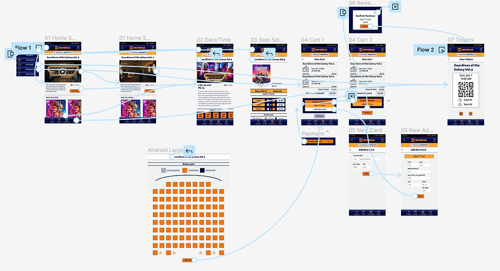
Prototyping
High Fidelity Prototype built in Figma including UI styling and components.
site map

Information Architecture
I created a site map to show how information should be stored and organized in the app.